Thursday, December 22, 2016
Thursday, December 15, 2016
Wednesday, December 14, 2016
Friday, December 9, 2016
Minimalist Photography
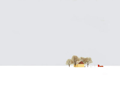
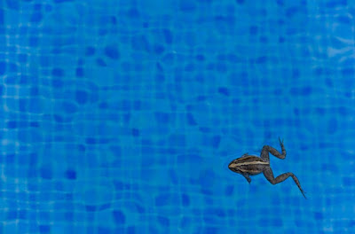
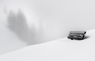
All of these photos are exemplary examples of minimalism in photography. The first photograph is my favorite because of the contrast between the white/grey background with the yellow house and green trees. I think it is a beautiful photography even though it is so simple. Even though the house and tree set up is so small in the photography, the contrast is so large and catches my attention right away. The second photograph is a very creative photograph. The set up is similar to the other photos in which the main focus of the picture is in the lower right hand corner. It is a very neat photo. The third photograph also shows minimalism because of the size of the bench. This also shows great contrast between the white/grey background against the black bench covered in snow. All of these photographs have such small focuses, but without them, the photos would not be whole.
Thursday, December 8, 2016
Friday, December 2, 2016
Photoshop Tutorial Edited Image
Old:
New:
I really liked this photoshop tutorial on how to apply a texture to a selection of a photo. It was very easy to follow and I easily found all of the tools that were required. All of the tools that were used were also common tools on photoshop that even beginners would know how to handle. My end result was consistent with the example on the tutorial because I followed the steps. This photoshop effect can be applied to any image and with any texture. It is a very open-ended idea.
Friday, November 18, 2016
Moby Video
I feel that this video is the most valid depiction of our society today. The entire video is shown through the perspective of a young boy. He sees everyone in the world trapped by cell phones. We have learned to rely on our cell phones too much. It has gotten out of hand. All we do 24/7 is have our faces in our phones. We have shut everything out of our lives and all we care about is social media, our appearances, and our devices. These cell phones have made us into monsters and we have lost all connection to human life. There was a part in the video when the young boy was on a subway and he kept bumping into people. The people turned around and grew into this hideous monster, rather than a caring citizen asking how he was. There was another part in the video when the young boy was walking on the sidewalk and kept trying to rip peoples phones out of their hands and get their attention. All the people ignored the young boy, and did not put their phones down. We are addicted and it has become a real issue. This video is inspiring and I would like to share this with a lot of people I know that have this issue.
Wednesday, November 16, 2016
Monday, November 7, 2016
Thursday, November 3, 2016
Wednesday, November 2, 2016
Friday, October 28, 2016
Monday, October 24, 2016
Wednesday, October 19, 2016
Monday, October 10, 2016
Monday, October 3, 2016
Wednesday, September 28, 2016
The Power of Internet Images
Based solely on the photographs she chose to post,what is the image that Jenny is trying to project?...Adventurous? Curious? Brave?
Jenny is trying to project the image of adventure, bravery, excitement, experienced, and trendiness.
Do you think she was successful?
I think she was successful because Jenny's post shows she has traveled and lived through cool experiences. She also shows trends because these pictures are popular types of pictures that you will see on a lot of younger girl's pages. Do you think that Jenny is someone who would be a good role model? A good mother? A good wife? A good friend?
I think she would be a good role model. She likes to explore and take people with her. She would be a good mother, wife, and friend because she would inspire other people to follow in her footsteps.
Monday, September 26, 2016
Scopophobia is the fear of being watched or followed. I chose this fear because of an experience my dad had with a stranger watching him when he was younger and living in Mexico City. From the story he told me and from things I have heard on the news, I would never wish an incident like this to happen to anyone.
Friday, September 23, 2016
Response to Work by Gottfried Helnwein Part 2
How does this change in viewpoint change your interpretation of the image?
Image #3 shows the actual work by Helnwein after being installed. From this viewpoint you can see the size and location of the work. The first image you saw (Image #1) was a photograph documenting the installation of this large-scale image.
With that in mind, describe Helnwein's image in as much detail as you can and in a separate post, record your answers on your Blog. Look at the image closely (Click on it to enlarge). What do you see? Describe it as if you were recounting it in detail to someone who had never seen it. Think about the scale--how could the size affect the meaning? Think about the material, the logistics and engineering of mounting it. Is it one contiguous image or is it spliced together or can't you tell? Think about the location--is it urban? Rural? Residential? Industrial? Given the image's location, who do you think will see the it? Who is the intended audience? Describe the mood of the image. What is the expression on the girl's face? Is it blase? Is it engaged? Is it optimistic? Wondering? Melancholy?
Now that I see the images from the real viewpoint, my interpretation has changed completely. It is not a photoshopped image and I feel it does not represent a bigger idea anymore. The original photo is of a giant billboard, larger than one I have ever seen. The young girl that I saw in the first image, covers the entire billboard. Her pale, emotionless face and head are the only things shown. The man that appeared to be repelling on rope, was actually doing so in real life. He is about the size of her iris and pupil, and again he is not photoshopped in. Because the first image was just a photograph documenting the installation of the billboard, I feel my interpretation has no meaning now. Now, I feel that the size of the young girl on the billboard was meant to emphasize her emotion, and has no relation to the man making his way down the board. The image on the billboard is not one contiguous image, zoomed in, there appears to be a few separated pieces that were put together. It is most obvious above her left eye, there are visible perforations where the two pieces would have come together. It is impressive enough that they were able to assemble pieces of this image, it is so large! At first glance, the location of the billboard appears to be in a very run-down industrial town. Then, after a closer glance, there are some houses with chimneys in the background of the third photo. If this was near a residential town, it would be very effective because parents and adults would be able to feel sympathy for the younger child as they drive by it. It would also appeal to the emotions of grandparents or elderlies because of the young child's expression. I believe adults of all ages are the intended audience. This piece made me fell sad for the girl and curious as to what her situation is. The title, "The Last Girl," evokes enough emotion within itself. Her expression also adds to the mood, she is emotionless and does not look concerned. Overall, I am surprised by the size of this image and have an entirely different interpretation after seeing the real product.
Thursday, September 22, 2016
Response to Work by Gottfried Helnwein
Describe the image as closely as you can. Write your description on your Blog. What do you think is going on here? Is this an artistic image or a documentary image (or both)? Is the image Photoshopped? Try to assign meaning to the image. What do you think the photographer's intent was? What does the image say to you? How does the difference in scale between the man and the girl's face add to your interpretation of the photograph.
This image features a young girl with a small man that appears to be repelling on her face. The young girl's face is zoomed in on and her right eye and eyebrow, her nose, and a small part of her upper lip are the only visible features. The small man is roughly the size of her iris and pupil combined. The small man is about one third of the way down what appears to be a strand of her hair that extends from the top of the photo to the bottom of the photo. I think that the man is making his way down her face and using her face for stability. It is an artistic image because it depicts an unrealistic idea. It is clearly Photoshopped because there is no man that small or girl that large that could be placed together in the real world. If his "rope" is a strand of her hair, then that would have just been sitting on her face normally. The only thing that would have been added in is the small man. This photograph could be saying something along the lines of the fact that the man is "walking all over her" except in this case he is repelling all over her. She shows no emotion as if she is not enjoying what is taking place. She is being used and the man also does not seem like it is a new thing for him. He is used to taking advantage of her. The photographer was trying to show this use of the girl through a less obvious layout. Right away, I didn't interpret the photo as anything special, but the more I look at it and evaluate it, I can tell there could be several meanings to it. The difference in scale between the man and the girl's face show many things. It could depict how the girl sees the man, she has little respect for him or she doesn't want him visible in her mind. He has such a small importance in her life. It could also show that she plays such a large role in the mans life and he relies on her for stability. The different meanings made me see the photo from different viewpoints.
This image features a young girl with a small man that appears to be repelling on her face. The young girl's face is zoomed in on and her right eye and eyebrow, her nose, and a small part of her upper lip are the only visible features. The small man is roughly the size of her iris and pupil combined. The small man is about one third of the way down what appears to be a strand of her hair that extends from the top of the photo to the bottom of the photo. I think that the man is making his way down her face and using her face for stability. It is an artistic image because it depicts an unrealistic idea. It is clearly Photoshopped because there is no man that small or girl that large that could be placed together in the real world. If his "rope" is a strand of her hair, then that would have just been sitting on her face normally. The only thing that would have been added in is the small man. This photograph could be saying something along the lines of the fact that the man is "walking all over her" except in this case he is repelling all over her. She shows no emotion as if she is not enjoying what is taking place. She is being used and the man also does not seem like it is a new thing for him. He is used to taking advantage of her. The photographer was trying to show this use of the girl through a less obvious layout. Right away, I didn't interpret the photo as anything special, but the more I look at it and evaluate it, I can tell there could be several meanings to it. The difference in scale between the man and the girl's face show many things. It could depict how the girl sees the man, she has little respect for him or she doesn't want him visible in her mind. He has such a small importance in her life. It could also show that she plays such a large role in the mans life and he relies on her for stability. The different meanings made me see the photo from different viewpoints.
Wednesday, September 21, 2016
Friday, September 9, 2016
Tuesday, September 6, 2016
Friday, August 26, 2016
Thursday, August 25, 2016
Subscribe to:
Comments (Atom)


